Violet vs Indigo vs Purple: What’s the Difference?
Point at the deep band in a rainbow and ask its name, and three answers come back: indigo vs violet is the argument that starts it, with purple claimed by everyone who gives up and picks the umbrella word. The three names are not interchangeable — they belong to three different kinds of thing.
The short answer: violet is a colour of light itself, indigo is a contested strip of the spectrum, and purple is a mixture your brain builds from red and blue. One is physics, one is an argument, one is perception.
What follows checks the three words against the dictionary entries, walks the spectrum band by band, follows the dyes from snail and plant to synthetic mauve, and ends with the cues, a quiz, and the verdict on which name to use when.
Understanding Violet, Indigo, and Purple
Quick Answer: indigo vs violet vs purple? Violet is a spectral colour — light of roughly 380–450 nanometres, the last band the eye sees. Indigo is Newton’s strip between blue and violet: a deep blue with a violet lean. Purple is not in the spectrum — it is what the brain reports when red and blue light arrive together.
The three words are used as if they were shades of one another, darker or lighter rungs on a single ladder. They are not.
Each name answers a different question — what the light is doing, where a border was drawn, what the brain did with two signals — and most of the confusion comes from asking one word to do another word’s job.
- Violet is a spectral colour: it exists as light itself, at the short-wave edge of everything the eye can register.
- Indigo is a claimed spectral colour: a band between blue and violet whose borders no two references draw in the same place.
- Purple is not a spectral colour: no single wavelength produces it. Red and blue light arriving together do.
| Colour | Type | Wavelength (nm) | What settles it |
|---|---|---|---|
| Violet | Spectral | 380–450 | A single band of light at the spectrum’s edge |
| Indigo | Spectral, disputed | No agreed band | Charts print everything from 425–450 to nothing at all |
| Purple | Non-spectral | None | Red and blue light arriving together |
The Indigo Cell Deserves a Warning
One cell of the familiar table deserves a warning before you memorise it.
Indigo is often printed with a tidy range of its own — 445 to 460 nanometres is a common one — but that range overlaps the violet band printed alongside it and leans into blue, and other references print entirely different numbers, or leave indigo out of the spectrum altogether.
The dispute is big enough to get its own section below.

Indigo vs Violet in the Dictionaries: The Entries, Checked One by One
Before wavelengths, check the words. The dictionary entries for the three are short, and they settle the argument in an unexpected way — each colour is defined through the others, and not one entry mentions light.
| Word | Cambridge Dictionary | What it tells you |
|---|---|---|
| Violet | “a bluish-purple colour” | The light word is pinned to the mixture word |
| Indigo | “a colour that is between blue and purple” | Indigo is placed, not measured — between blue and the mixture |
| Purple | “of a dark reddish-blue colour” | Purple is pinned to red and blue — its two ingredients |
Read the three entries together and a circle appears. Violet is explained by purple; purple is explained by red and blue; indigo is explained by standing between blue and purple.
The dictionary is not being lazy — it is reporting how the words are actually used. In everyday English, purple is the anchor word, the one everyone owns, and violet and indigo are refinements of it: violet is purple pulled toward blue and brightened, indigo is purple pushed down toward a deep, quiet blue.
Indigo’s Double Life
Indigo also lives a double life the other two do not. The same Cambridge entry continues to a dye “used to make things blue” and to the tropical plant the dye originally came from — which is why indigo, alone of the three, names a substance as well as a colour.
When someone says indigo, they may mean a wavelength claim, a pair of jeans, or a plant, and only the sentence around it says which.
What the Entries Settle
Entries settle colour words the way they settle small words. The traveller’s pair in on the plane or in the plane was decided by reading exactly this kind of entry — the dictionary, not the object, had the last word.
Here the entries say: if you mean the light, say violet; if you mean the border strip, say indigo; if you mean the mixture, say purple.
The Science Behind the Colors
Light Spectrum Basics
Visible light is a narrow strip of radiation, running from red at roughly 700 nanometres down to violet at roughly 380. Violet is the shortest wavelength the eye can register and the highest in frequency — the spectrum simply stops there, with ultraviolet continuing invisibly beyond it. Indigo’s claimed seat is immediately beside violet, one step toward blue.
Purple’s absence from that strip is the single most useful fact on this page. The spectrum is a line, each point on it one wavelength, and no point on the line is purple.
Purple appears only when the line’s two ends — red light and blue light — reach the eye at the same time. A rainbow, which is sunlight sorted by wavelength, therefore contains violet and can never contain purple.
A Slogan With No Author
A slogan circulates in colour writing — “violet is light, purple is perception” — usually with no verifiable author attached. Treat the byline with suspicion and the physics with respect: the sentence is a fair summary of the spectrum, whoever wrote it first.
How the Eye Sees Color
The retina carries three types of cone cell, tuned broadly to long, medium and short wavelengths — loosely, red, green and blue. Purple is what the brain reports when the red and blue cones fire together and the green cones stay quiet: a two-signal colour, assembled on arrival.
Violet light plays a subtler trick. It drives the blue cones hard, and because the red cone has a second, smaller peak of sensitivity at the short-wave end, violet also stirs the red cones weakly.
That faint red signal inside a blue one is why violet looks the way it does — a blue with something warm hiding in it — and why it is so easily confused with the purples it merely resembles.
What Screens and Pigments Cannot Do
Two consequences follow. A screen cannot show you true violet: it has no violet emitter, so it fakes the spectrum’s edge with red and blue light — a purple standing in for violet, as the codes section below shows in numbers.
And a violet pigment, though real pigments exist, reflects a spread of wavelengths rather than one: paint can match violet’s look, never its physics.
The Wavelength Problem: Why Indigo’s Numbers Never Agree
Indigo owes its seat in the spectrum to one man’s love of the number seven.
Isaac Newton first divided the spectrum into six named colours — red, orange, yellow, green, blue and violet — and then added indigo as a seventh, so that the colours would match the seven notes of the musical scale, the seven days of the week and the seven known bodies of the solar system.
The band was inserted to complete a pattern, not because the eye demanded it.
What the References Print
The eye, by most accounts, still does not demand it. Human vision is relatively insensitive at indigo’s frequencies, and many people with perfectly good sight cannot separate indigo from the blue on one side of it and the violet on the other. Modern references have quietly responded by dropping the band or refusing to number it:
| Reference | What it prints for indigo |
|---|---|
| Newton’s spectrum (Opticks, 1704) | A named band between blue and violet — no numbers |
| Many school and study charts | A band of 445–460 nm, or 450–475 nm |
| Other reference charts | A band of 425–450 nm |
| Wikipedia’s spectral colours table | No band — indigo omitted; violet runs 380–450 nm |
| ThoughtCo’s spectrum guide | “There is no wavelength assigned to indigo” — about 445 nm if a number is forced |
So when any page prints indigo’s range to the nanometre, treat the precision as decoration. The honest statement is positional, and it is the one the dictionary makes: indigo, if it is anywhere, is the deep strip on the blue side of violet.
Historical and Cultural Significance
Violet and Royalty
Violet’s royal reputation is largely borrowed finery. The costly dye of the ancient world produced shades that a modern eye would file across violet and purple alike, and the courts that wore those shades did not separate the two words the way physics does.
What violet owned outright was the sacred register: in stained glass, illuminated manuscripts and church art, it was the colour of divine light and mystery — the visible edge of the invisible.
Born in the Purple
The famous phrase needs its room restored. “Born in the purple” is usually explained by imperial wardrobes, but the documented source is a place: the Porphyra, a chamber in Constantinople’s Great Palace lined with purple porphyry stone, where reigning empresses gave birth.
Children born there took the title Porphyrogennetos — “born in the purple” — and the phrase has meant born to power ever since. The purple was in the walls before it was on the child.
Indigo’s Global Journey
Indigo the dye has the longest documented journey of any colour on this page. It comes from plants — Indigofera tinctoria above all — and it is old beyond easy imagining: indigo-dyed cotton excavated at Huaca Prieta in Peru has been dated to around 6,000 years ago, making indigo one of the oldest dyes known anywhere.
Egyptian linen, Indian textiles and West African ceremonial cloth all carry it, and at the height of its trade it was valuable enough to be nicknamed “blue gold”.
Blue Gold to Blue Jeans
In the 17th and 18th centuries the dye became a plantation crop and a colonial fortune in India and the Americas, with all the human cost that plantation economies carried.
Synthetic indigo, industrialised at the end of the 19th century, collapsed the price — and delivered the colour to its modern home. The deep blue of denim, the most worn colour on earth, is indigo: the spectrum’s disputed band survives not in rainbows but in jeans.
Purple Through the Ages
Purple’s career begins with a snail. Tyrian purple was extracted from the glands of murex sea snails — thousands of animals for a single garment’s worth of dye — and Rome guarded the colour with law as well as price: at times the full purple was reserved to the emperor alone.
Scarcity plus statute made it the uniform of power for two thousand years.
The Laboratory Accident
The monopoly broke in a laboratory accident. In 1856, eighteen-year-old William Henry Perkin was attempting to synthesise quinine, the malaria treatment, when his experiment produced a purple residue instead: mauveine, the first synthetic dye.
Within a few years purple had fallen from an emperor’s privilege to a fashion anyone could buy, and it has carried both meanings — majesty and creative rebellion — ever since.
| Era | Source of the colour | What it meant |
|---|---|---|
| Ancient Rome | Tyrian purple, from murex sea snails | Rank enforced by law — the emperor’s colour |
| Medieval Europe | Costly plant and mineral dyes | Spirituality, penance and rank |
| Victorian era | Perkin’s synthetic mauveine (1856) | Fashion for everyone — progress you could wear |
Artistic and Design Perspectives
Color Mixing Fundamentals
On a palette, the three names are three recipes, and the balance of red and blue is the only dial:
- Violet: lean the mixture toward blue — more blue than red keeps it cool and bright.
- Indigo: begin from a deep blue and darken it; a touch of violet pulls it away from plain navy.
- Purple: red and blue in balance — shift the balance and the colour warms or cools on the spot.
Additive (Light) vs Subtractive (Pigment) Mixing
| Model | Primaries | How the family forms | Where you meet it |
|---|---|---|---|
| Additive (light) | Red, green, blue | Red + blue light = the magenta-purple family | Screens and stage light |
| Subtractive (pigment) | Cyan, magenta, yellow | Cyan + magenta = blue; violet shades are built from that blue with extra magenta | Print and paint |
Why the Subtractive Row Misleads
The subtractive row is the one most often printed wrongly, in widely copied tables that have magenta plus cyan producing violet or purple. The arithmetic of absorption says otherwise.
Cyan ink absorbs red light; magenta ink absorbs green light; lay the two together and the only light left to reflect is blue. Print’s violet enters through the blue door, with magenta added on top — it is never the first thing the two inks make.
Techniques for Artists
Painters steer their purples by temperature: a mixture warmed with a crimson behaves like evening light, while one cooled with ultramarine sits in shadow. Digital artists skip the steering and type the colour instead, which is why the three codes matter — they are the definitions most software actually uses:
| Colour | RGB | HEX | CMYK |
|---|---|---|---|
| Violet (electric) | (143, 0, 255) | #8F00FF | 44, 100, 0, 0 |
| Indigo (web) | (75, 0, 130) | #4B0082 | 42, 100, 0, 49 |
| Purple (web) | (128, 0, 128) | #800080 | 0, 100, 0, 50 |
Two of these CMYK conversions circulate in incorrect forms — the corrected figures are derived in the codes section below. And the violet row carries a catch the size of the whole argument: its RGB recipe is mostly blue with a large dose of red, which is to say the screen’s violet is built like a purple. Read on.
The Codes, Checked: Why Screen Violet Is Always a Mixture
The hex code #8F00FF is known as electric violet — the screen’s closest shout at the spectrum’s edge. Its recipe gives the game away: 143 parts red, no green, 255 parts blue.
A monitor has no violet light to offer, so it fakes the shortest visible wavelength out of the two ends of its own range, red and blue together. That is the recipe for purple.
Every violet you have ever seen on a phone screen is a purple wearing violet’s name — and the web’s named colour “violet”, #EE82EE, is not even that: it is a pale pink-lavender, the flower’s colour, nowhere near the spectrum’s edge.
The CMYK Column, Checked Figure by Figure
The CMYK column rewards the same checking, because conversion is schoolbook arithmetic. The black value, K, is set by the darkest channel; each ink is then the shortfall of its channel against the brightest.
For web indigo, (75, 0, 130): the brightest channel is 130, so K = 49, and cyan = (130 − 75) ÷ 130 ≈ 42. The figure of 83 sometimes printed in that cell would count the blue twice.
For web purple, (128, 0, 128): red and blue are exactly equal, so cyan = (128 − 128) ÷ 128 = 0 — a colour with equal red and blue needs no cyan at all, and the 50 sometimes printed there is simply wrong. Only electric violet’s conversion, 44, 100, 0, 0, survives the check unchanged.
What the Recipes Settle
Codes are where the three words stop being impressions and become recipes, and the recipes vote with the physics. Indigo and purple can be specified exactly, in ink or in light. Violet the light cannot be coded at all — only approximated, by a mixture, under its own name.
Violet, Indigo, and Purple in Nature
Violet in Flora
Nature’s violets are mostly flowers: violets themselves, irises, orchids, and the pale-purple heads of lavender. The audience for these colours is not us.
Bees see into the ultraviolet, beyond the band where our sight stops, and many violet-range flowers carry ultraviolet patterns that steer pollinators to the centre — the edge of the human spectrum sits near the middle of a bee’s.
The flower’s retiring habit gave English a phrase as well as a colour: a “shrinking violet” is still the language’s picture of shyness.
Indigo in Natural Elements
Indigo in nature is a transformation you can watch. Cloth dipped in an indigo vat comes out yellow-green, and blues in the air as the dye oxidises on the fibre — the colour literally develops in front of you, which is one reason dyers across Asia and Africa treated the vat as something close to alive.
Beyond the vat, the word attaches to depth: the deep blue hour of twilight, darker than the day’s blue and not yet night, is the sky’s indigo.
The Rainbow Debate
Newton’s seven colours survive in every schoolroom mnemonic, but the spectrum itself is continuous — the bands are names laid over a gradient, and indigo is the name most often lifted off again. Many modern spectra are labelled with six colours, blue passing straight into violet, and nothing visible changes.
Indigo keeps its place for two reasons that have little to do with light: the dye’s five-thousand-year prestige, and the fact that seven is a satisfying number. The debate is a tidy lesson in the difference between a colour of light and a word with a history.
Symbolism and Emotional Impact
Strip the physics away and each name carries a reputation — built, as reputations are, from its history rather than its wavelength:
| Colour | Associations | Where the association comes from | Common uses |
|---|---|---|---|
| Violet | Spirituality, mystery, creativity | The edge of sight; church glass and sacred art | Wellness and meditation branding, art |
| Indigo | Intuition, wisdom, dignity | The dye’s gravity; deep, hard-wearing cloth | Denim, uniforms, study spaces |
| Purple | Luxury, ambition, confidence | Two thousand years of expensive dye | Fashion, beauty, premium branding |
A caution belongs with any such table: these meanings are conventions, not measurements. They are real in the way manners are real — widely shared, quickly read, and entirely capable of changing.
Applications in Modern Culture
- Branding: purple is the premium shelf’s favourite colour. Cadbury’s shade is famous enough to have been fought over in court, and Hallmark built a crown logo and a luxury register on the same hue — both are buying the dye’s old scarcity by association.
- Fashion: deep violet reads as elegance, while the family’s lighter lilacs and lavenders read as softness and romance; the same dial, turned down.
- Interiors: indigo walls and textiles are the study’s usual prescription — a colour associated with calm and concentration, borrowed from the dye’s sober working clothes.
One famous verdict on all of this can actually be traced. Wassily Kandinsky, who experienced colours almost as sounds, opened the colour theory of Concerning the Spiritual in Art (1911) with the claim: “Colour is a power which directly influences the soul.” The sentence is genuine and its source can be named — which is more than can be said for most of the colour quotations in circulation, and the bar worth holding them to.
The Family Around Them: Lilac, Lavender, Mauve and Magenta
Four neighbours crowd the same shelf, and sorting them finishes the map. All four are purple-family words, distinguished by lightness and lean — and none of them is a spectral colour:
| Word | Where it sits | Named for |
|---|---|---|
| Lilac | Pale purple, leaning pink | The lilac flower |
| Lavender | Pale purple with a grey lean | The lavender flower |
| Mauve | Dusty, muted pale purple | The mallow flower — French mauve; Perkin’s dye took its name from the colour |
| Magenta | Full-strength red-blue, non-spectral | The Battle of Magenta (1859), in whose year the dye was renamed for it |
The pattern is worth noticing: where violet is a wavelength and purple is a mixture, the rest of the family is a garden and a battlefield — colours named for flowers and fame, not for physics. Violet stands alone in the family as the one that is light itself.
How to Tell Violet, Indigo, and Purple Apart
Quick Visual Cues
- Violet: the cool end of the family — visibly blue-leaning, and the brightest of the three at a glance.
- Indigo: deep and muted — a navy that has swallowed a violet tinge, darker than it is colourful.
- Purple: the balanced one — red is fully present in it, which makes it warmer than either neighbour.
Two field tests help. The rainbow test: if a prism could show the colour, it is not purple — purple is the one the prism can never produce. The daylight test: mixtures shift their lean as the light changes, so a colour that looks blue-ish indoors and red-ish in sun is behaving like the mixture it is.
Practical Guide
| Attribute | Violet | Indigo | Purple |
|---|---|---|---|
| Tone | Cool, blue-leaning | Deep cool, muted | Warm or neutral, red present |
| Position in spectrum | Yes — the final band | Claimed — between blue and violet | No — perceived, not spectral |
| Common use | Flowers, gemstones, art | Denim, dyes, uniforms | Fashion, branding, décor |
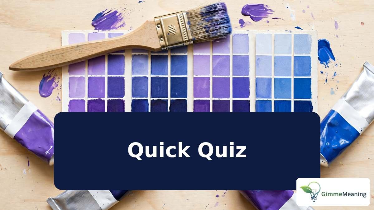
Quick Quiz: Violet, Indigo or Purple?
Five colours, three names — the tests above settle all of them.
- The final band of a rainbow, a single wavelength of light. → violet — the spectrum’s edge is a colour of light, not a mixture.
- The colour of your jeans, from a plant dye already ancient when the pyramids went up. → indigo — the dye first, the wavelength claim second.
- A colour no prism can ever show you, mixed from the spectrum’s two ends. → purple — red and blue together, with no band of its own.
- The swatch #4B0082 on a designer’s screen. → indigo — the web colour indigo, a deep blue with a violet lean.
- Pantone’s Color of the Year 2022, a colour the company built from scratch. → none of the three, exactly — Very Peri is a periwinkle blue with a violet-red undertone, filed by its own maker among the blues.
Five out of five means the family has stopped blurring: wavelength, mixture and lean now do the naming for you.
Case Study: Color in Design
In December 2021, Pantone announced its Color of the Year for 2022: PANTONE 17-3938, Very Peri.
It was the first time the company had created a brand-new colour for the title instead of choosing an existing one — and its own description is a small masterclass in this article’s distinctions: “a dynamic periwinkle blue hue with a vivifying violet red undertone”, blending, as Pantone put it, the faithfulness of blue with the energy of red.
Where the New Colour Files Itself
Notice where the new colour files itself. Not as a purple, though red and blue are both in it; not as a violet, though violet survives in its undertone; but among the blues, the family indigo also leans toward.
Designers still reach for indigo when a layout needs gravity and for violet when it needs a spark — and what most brands actually buy, under one name or another, is the mixture. Very Peri is proof that even the world’s colour authority, inventing freely, produced a colour the three words can only circle.
FAQs
What’s the main difference between violet and purple?
Violet is a single band of light at the spectrum’s end, roughly 380–450 nanometres. Purple has no wavelength at all: it is the brain’s answer when red and blue light arrive together, so no rainbow ever contains it.
Is indigo closer to blue or purple?
To blue. Indigo sits on the blue side of violet in the spectrum, and the web colour indigo, #4B0082, reads as a deep blue with a violet lean. Newton’s placement of it beside violet is why the argument never quite dies.
Why is purple not part of the rainbow?
A rainbow is sunlight sorted by wavelength, and every band in it is one wavelength of light. Purple is never one wavelength — it takes two, red and blue together — so there is no band for a prism to show.
Can you make violet paint?
You can mix a violet paint — ultramarine with a red-leaning magenta gets close — but it will always be a mixture reflecting several wavelengths. No pigment mixture reproduces single-wavelength violet light itself; paint approximates the look, not the physics.
Why was purple considered royal?
Because the dye was ruinously scarce. Tyrian purple came from the glands of sea snails, thousands of animals for a single garment, and Rome restricted the colour by law. Scarcity plus statute made purple the uniform of emperors.
Conclusion
So the three names divide by kind: violet is light, indigo is a border dispute, and purple is a mixture. Settle indigo vs violet by asking which side of blue the colour leans from, and reserve purple for everything the spectrum cannot produce.
Cambridge Dictionary defines violet as “a bluish-purple colour” — a reminder that even the dictionary settles the argument by pointing one word at another. Learn the three tests — wavelength, mixture, lean — and the names stop blurring: you will know which one you are looking at, and why.




One Comment